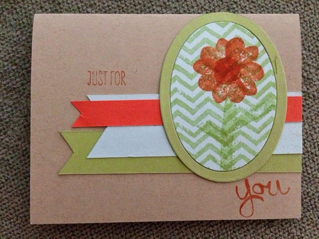
Posts

Showing posts from 2014

A rainbow of colors

Image
This week's ColourQ challenge had a very bright palate this week. You know when you have 'that card'?  The one you L. O. V. E. love?  I never, NEVER would have guessed this color combo would make that card, but there ya go!  The layout was from Paper Pals Arts challenge.  I used my new Work of Art stamp set with a very retired Year by Year stamp set. I wanted a gift image and this one was the perfect size and style. The sentiment is from Remembering your Birthday, cause I needed another birthday set!!!  I love the clean look of the card  and it was  so quick and easy!   This is definitely a flexible card that I will make over and over again. 

New toys at my house!!

Image
Can I just say how much I LOVE the new Work of Art stamp set from the upcoming Stampin Up catalog??!  I am for seeing many many many projects with it in my future.  I have to admit that there have been a lot of beautiful cards with this set during the demo presales. A LOT. Obviously I'm not the only one who loves this set. I went a different direction, you know, just to be different.  I used the heart stamp as petals, which I like, and the chevron stripe for a background, which I love. The layout is courtesy of HandStamped sentiments sketch challenge #186 and colors are from the color Throwdown #293.  As I was making out this post I decided to do a redo to see if I could fix a few little things.  Minor changes for a little more subtle look. Oh, yes. I will definitely use this stamp set, possibly every day. Whoop!

Graduation days...

Image
A dear teacher of my DD is celebrating her high school graduation this week. She is an amazing girl and we will miss her when she leaves for Texas A&M in August. I chose the color combo from Colourq Challenge #241 to tell her how proud we are of her. Here is a close up of the card: And the colors: I have one more post for you with a digital creation that works with Project Life.  That'll be out tomorrow.  Until then, thanks for visiting!

I've been here, but...

Image
I seem to get projects done then I get distracted and just don't get them posted. Sigh. Well, here is one I've been working on. This color combo is from the  Color Throwdown #292 The layout is inspired by Mojo Monday #345  I had a little piece of metallic silver card stock stashed away so I embossed it with argyle and added matching pewter embossing powder as sprinkles. (Note to self, do the wet embossing BEFORE you glue the punches to the card!).  Thats the first... one more coming today!

ColourQ #240

Image
ColourQ Challenge colors of the week remind me of my grandmother's china- delicate and pink. I realized I had a box that I made with it earlier this spring and never posted, so here ya go! The DSP is from many years ago and uses Riding Hood Red, Pink Piruette and Kiwi Kiss.  I added Primrose Pink and Newsprint DSP to the mix.  The box pattern was found on Pinterest, one of my favorite idea markets :)  I will make the box again, maybe for Father's Day. It really is easy to put together and folds flat in a normal envelope. Very cool!

Teacher Appreciation #3

Image
Last one. My 5th grader has 2 main teachers and wanted a more girly card for her math/science teacher. DD insisted I use some pewter embossing powder on it, so I Gorgous Grunge-d it on. She also wanted a butterfly. As I was coloring the flower with Stampin' Markers I got very excited to try the soon to be released Blendabilities. I have some on order so I will share soon.  Thanks for visiting and Happy Mother's Day !

Teacher Appreciation take 2

Image
My DS teacher has been so supportive and helpful!  I wanted this card to be a little more masculine because I thought it would be weird for my boy to give a flowery card to her. Maybe it's just me, but anyway. Her favorite color is green so I used Gumball Green with Midnight Muse and Marina Mist. The layabout is inspired by the Case this Sketch challenge  I am really going to miss Midnight Muse when it retires at the end of the month along with the grid stamp. I will still use them, but have to remove them from 'active' status. Sad, but the new colors are coming soon to freshen the palate... I just ordered mine today as my Mother's Day gift (thanks kids!) so next week I get new toys in the mail. Yeah Stampin' Up! I have one more teacher appreciation card to post tomorrow. Thanks for visiting!

Teacher appreciation Thanks!

Image
This is Teacher Appreciation week so I aimed my cards for my munchkins' teachers.  Here is the first.    My DD language arts teacher is a UTX grad and LOVES burnt orange.  The color combo from Hand Stamped Sentaments #185 gave me some Tangerine Tango, which is NOT burnt orange, but close enough for my book (since I'm not a TU fan).  The layout was inspired by  Paper Craft Crew Challenge #91 , which I missed the entry for but still loved enough to play with. Here is my creation:     The tag is from Chalk Talk framelits set and the stars, arrows and thx is from the tri-fold framelit set (which will be in the new catty, yeah!!).  I splattered with Gorgous Grunge in Versamark, Brown Sugar, and long-retired and yet highly loved Very Vanilla craft ink.  I still have a pad and I will use it til it goes dry! Many thanks to Mrs. White for all that she has taught (and put up with for) those rambunctious 5th graders! Another TA card tomorrow for DS teacher.  Thanks for visiti

PPA 202 & FMS 134

Image
All of a sudden, today in North Texas it was summertime.  96 degrees summertime.  And water restrictions are officially in effect for the unforeseeable future.  Sigh.  I am so glad we had a moderate spring because my tomatoes have set fruit, my snap beans are charging along and my strawberries are so yummy right off the vine.  Yep, it is early summer in Texas and I plan on enjoying it before the heatwave comes in. I got a lovely box in the mail on Friday with new Stampin' Up toys to play with and a desperately-needed restock of Whisper White card stock.  I will post new Project Life samples as soon as I get it sorted out; I have a feeling that it is going to CHANGE my scrapbook outlook in the future.  Simplicity at its finest, folks.  And the new catty, which goes live on June 2, has FIVE Project Life themes to create your own scrapbook quickly.   I am so ready to get going! I promised grunge, but decided to go a bit cleaner.  The arrows are from the Project Life Point and Clic

ColourQ Challenge #239

Image
Today's card is the epitome of girl.  But when I saw the colors from ColorQ this week I just had to try.  The best part was I got to use some ancient retired DSP that I think I inherited from my sister. Don't you love it when you realize that you have JUST the paper to match that??  I do!!  I put together the majority of the card and realized I was VERY close to one of the layout challenges' layouts so I went with it.  The base is Pink Pirouette because I couldn't find the Pretty in Pink card stock, but I think it melds well with the other colors.  The DSP is Sweet Always, again from the retired stash.  I used soon-to-be retiring Create a Cupcake stamp set (but no worries, there is a new one in the new catalog so we can punch some more adorable cupcakes next year).  The sentiment's corners are rounded using the new Project Life corner rounder, just introduced last month.  I played with it and have some very cool ways to use it aside from rounding corners..... 

A week off and back to normal....

Image
I hope your weekend was wonderful and relaxing! After taking most of a week off the challenges I was working on have all been closed. Bummer!!! But tonight I put together a card for this week's  Sketch Frenzy Friday  and  Fab Friday Stamp Challenge . I love the clean and simple layout!  Good thing because the color combo is very unusual.  I had a hard time balancing the starfruit with the cantaloupe.  Fruit salad, anyone?? The pattern paper is from soon-to-be-retiring Venetian Romance designer paper. I fussy-cut 3 of the filigree and layered with Summer Starfruit (I will never love this color, but it does make a striking focal for this card).   The stamp is from Sale-a-Bration See You Later stamp set. It still needed a little something so I added a few flowers.  Here are the challenge graphics. I wish you a blessed week! Jean

April Stylin' Stampin' Inspiration

Image
What do you do with Wisteria Wonder, Gumball Green and Very Vanilla that isn't a flower???  That is what I asked myself when I saw the April Color Challenge at  StylinStampinInkspiration .  Here is what I came up with I have been making a lot of floral cards lately and I have wanted to play with the Postage Due stamp set. I had a layout, which I can't find anymore. Oh well. Anyway, I would have been very happy to just use the Wisteria, so I just used the Green as washi tape from the Tape It stamp set.  Love love love the faux washi tape!!   It makes a statement with the pops  of color.   Quick and easy with lots of layers. Yeah!! Thanks for visiting!!

Project Life <> Stampin' Up, Retiring Product Lists and Free Shipping

Image
So, what happens when you are rushing to get an order done and prepping for an Easter trip  on the same 2 days??  Overwhelmed!!  That was me last week, then we spent 4 days at my parent's house and came home on Sunday.  I did a lot of thinking about crafting but not a whole lot of hands-on. Lots and LOTS of new things on the Stampin' Up front have been announced in the last week.   We are so so so excited to let you know we’ve partnered with the amazing Becky Higgins to bring you the real deal—authentic Project Life products, now in exclusive Stampin’ Up! colors and designs. If you’ve somehow missed the Project Life craze and are wondering what it’s all about, we’ll fill you in: it’s a super simple, totally affordable way to get your photos into albums: you just slip your photos into Photo Pocket Pages and add designed cards. It’s a back-to-basics approach to documenting your life. In a nutshell, it’s all about spending more time making memories and less time scr

Pinwheels for ColourQ 236

Image
I hope your Saturday has been relaxing!  My Texas Rangers play at 7:05 so I have to get this out now! I'm playing with color again and using some long-overlooked supplies. I have been in 'spring flowers' phase, which is easy with Stampin' Up's numerous floral stamp sets, and I have many of them!  But as much as I could have easily gone the Hawaiian hibiscus route with this combo from  Colourq challenge 236  , I decided  to do this: The layout is from   Paper Craft Crew sketch 88 . In hindsight I would have used a bit more Bermuda Bay  (note to self: don't glue until you are really sure!)  but overall I am very happy with it.  I originally had one pinwheel, then I kept adding until there was no more room.  I love these for summer and the colors are spot on. The light blue is long-retired Cool Caribbean, my favorite in-color in 2007. Well, one of them at least :). I still have lots of card stock, but I only have half a sheet of Peach Parfait so I had to be

Color Throwdown for Easter

Image
Happy Friday!! Easter is almost here!  I can tell because I have been using so much pastel the last few weeks. This card uses long-retired Barely Banana, Soft Sky, and Pistacio Pudding for a delicate Easter look. The combo is from  Color Throwdown 287  and the layout is  Sketch Frenzy Friday .  This card was quick and easy. The Nature Walk stamp set provided the eggs I used instead of the banners on the sketch and I used the bird as a background for the sentiment. Wish you all a great weekend!

First Christmas card of the year

Image
Oh yes, a Christmas card in April.  But I just couldn't help it.  See there is a lovely challenge from Merry Monday Christmas Challenge to build a snowman and then Mojo Monday had some lovely circles to play with and look what happened!!!  Frozen is so HOT right now that I just had to do it!   I don't do such intricate punching very often.  In fact this is the 2nd face I did because the first one looked maniacal.  This one the glue dried too quickly and messed up the paper before the eyes were placed correctly.  Sigh... I'll be playing with this one again to see if I can expidite the process and get a better result.  The arms and hair are hand cut, the eyes, nose and charcoal were punched with the mini circle punch and trimmed.  The colors are not your ordinary combo for Christmas, but I just love Baha Breeze (I miss it so!) and Island Indigo and Raspberry Ripple look great with it.  I used a bit of retired Sale-a-Bration Indigo ribbon to accent. Stamps: Sere

Two new cards for spring

Image
For a long time I didn't make time to craft.  I was on Pinterest getting ideas and visited blogs to see others creations but did virtually no paper crafting of my own.  I'm trying to change that and this blog is my proof. Except when I don't post what I have made! So, I'm sorry it is so late coming, but at least its out!  Here are two different cards that I made Sunday and Monday: I finally got my hands on the Wetlands stamp set.  At first I wasn't excited about it, but then I began to see the beautiful artwork being made with it and I had to try it out too.  This week there are two different challenges that use the same flavor color combo: Daffodil Delight, Crushed Curry, Old Olive and Pool Party.  So I'm going to enter into both if I haven't missed the deadlines.... The other card is done with one of my favorite ALL TIME stamp sets that Stampin' Up has ever released.  It is called Blessed Easter and I have used it over and over again sin

Friday night girls night

Image
Friday and Saturday were girls days at my house while the boys went camping.  We got pizza and caught up on our American Idol. Then I got out the paper!  This card was inspired by 2 challenges:  Colourq #235  and  Techno stamper #308 . The patterned paper is retired Birds of a Feather DSP.  The swirl is from Creative Elements and the sentiment is from Happy Watercolor.  I wanted to use more retired River Rock, but finally I settled for a simpler and brighter design. Thanks for visiting! Jean  

Orange you glad its spring?

Image
Orange is not my favorite color. There. I said it. I don't wear it, I don't design with it, and I rarely craft with it... Well except for Halloween. So when I saw this weeks Colour Me card challenge  challenge  to use only Pumkin Pie and neutrals I made myself get out of my comfort zone and do it! I am still thinking spring and thought I'd use orange as a pop of color rather than my normal drenching. I used a long-retired stamp set Easter Blossoms and the butterfly from Nature Walk with Crumb Crake ink. Then I went a little crazy and made another one. This is a bit more in my wheelhouse!  The stamps are from  Life in the Forest and ABC-123 Outline Alphabet & Numbers. The patterned DSP is retired Lets Eat Cake. My neutrals are Sarah Sand, Crumb Cake, and Cajun Craze. The layout is courtesy of  Try Stampin on Tuesday .   I  really do love that fox! Tomorrow.... More colors, more cards!