Posts

Showing posts from 2012

ColourQ #156

Image
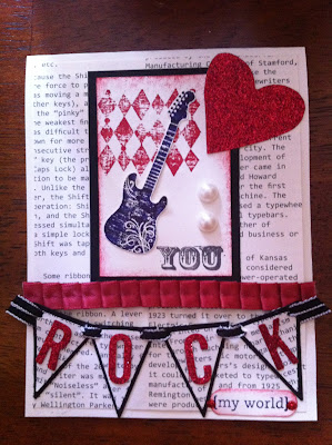
I am so glad to be back!  PTA has run me ragged for the last few weeks, so much so that I look at the end of the weekend and have touched no paper, no glue, no scissors.  Oh have I missed it!  So, to ring in a new start here is my contribution to this week's ColourQ challenge I'm always looking for a more masculine color combo and this one did the trick!  Tho I would never have picked these colors myself they really came together, and not in the fall-style that I was tempted to turn to.  Plus, I just love Love LOVE Dusty Durango and was glad to get to pull out my marker again.  This was very quick to put together and would have been even faster if I had left the embossed paper with straight lines instead of zig-zagging them.  Anyway, thanks for looking.  Gotta get back to the game.  Go Rangers!!!! Jean

ColourQ Challenge #152

Image
I've been away for awhile.  No excuse except summer!  But now that it is over I hope to post at least once a week.  Promise I will try harder!!! This week's ColourQ combo really spoke to me.  I have loved Bermuda Bay since I first saw it in its in-color days many years ago.  So I enjoyed this challenge! I started out with a Crumb Cake base and layered a thin line of white then Bermuda Bay embossed with the Sizzix script folder with Versamark added to one side for more definition.  I tied it with ribbon and added the Gumball Green stitched ribbon as an accent. I stamped an image from Serene Silhouettes, one of my new favorites, in Bermuda Bay and Gumball Green and cut it with the labels die cut.  I mounted it on DSP from Parisian Breeze pack, another from my 'collection' :),  Added an antique brad and a sentiment from Made for You stamp set in Basic Grey and another little bit of Gumball Green ribbon. Thanks for looking!

ColourQ #144... just in time!

Image
This weeks  ColourQ  challenge was a patriotic combo:  Poppy Parade, Calypso Coral, Night of Navy, Brocade Blue, and White.  I thought flags and kids and fireworks!  But then I was sitting at the baseball fields waiting for fireworks to start and listening to a band play a little Springsteen when the idea came for this card: Nothing says Independence more than the free spirit of ROCK!  And yes, my grunge factor kicked in again this week.  I used Grunge Rock to liven this up.  Oh, and I didn't have any Brocade Blue paper, ran out at least a year ago, BUT I did have the very classic Buckaroo Blue paper and ink to use instead.  I hope you like this throwback as much as I loved creating it!

Vacation and ColourQ

Image
Happy July!   We are back from our vacation to Colorado Springs.  It is so cool to look out the back and see the mountains!  I highly recommend the Cheyenne Mountain zoo and the train up to Pikes Peak.  We brought the heat with us, record temps in Denver while we were there, and then brought them back home too!  Thankfully we just missed the fires and pray for all those in Colorado that are affected by the blaze.  We would have been evacuated if we had still been in town.   So, on the note of water and vacation, here is my take for the ColourQ challenge #143: This weeks colors are Pacific Point, Poppy Parade, So Saffron, Basic Grey and white.  I started out making layered flowers and then, all of a sudden, I saw this in my mind's eye.  Wow!  I used recently retired Extreme Elements, which I still love, and embossed the surfer in black.  Blacks not on the list!  I know, but I tried to mix the black and white powders to get grey and it looked weird so I just went with my gut and

ColourQ #141 for Father's Day

Image
This week's ColourQ colors have a very masculine feel, so I decided to use them for a couple of Father's Day cards for the dads in my life. So, I played with some old texture folders I had stuffed in my craft bin (literally!) and finally decided to go with this: What do you think?  I'm liking the swirlies and waves going on!  Hopefully my dad and hubby will enjoy them too.  Well, that and a new coffee maker, but shhhhh!  don't tell! Have a marvelous weekend!

Colourq... late!!

Image
OK, sorry.  I was running very late getting this into the ColourQ competition on time.  Final embellishments had to be made, phone retrieved from ds, pic and post.  Whew! This weeks  ColourQ  combo was Pool Party, More Mustard, Poppy Parade, Crumb Cake, and White.  Now, I have to admit that Mustard is my least favorite of all the SU colors, i.e. I reallly! don't like it.  But. This combo isn't too bad.  I really like the PP and PP together (too bad Poppy Parade is retiring in 3 days!!!) and they look fab with Crumb Cake so.... here is what I came up with.  This set is another retiring hostess set, Love and Care.  The frames are continuing in the new catalog, tho, so look for more fun ideas on using them. Thanks for looking, and happy Memorial Day!

ColourQ Entry of the week 5/20/2012

Image
This is the card I am submitting for this week's ColourQ Challenge.  The colors we used this week are Tempting Turquoise, Wisteria Wonder, Lucky Limeade, Basic Grey and White.  I used a well-loved, and nearly retired, stamp set Peace Within and "water colored" the image with the colors.  The message is from the same set; I filled it in with Crystal Effects to make it stand out, but it made the ink smear a little.  I'll have to play around with that and see if I can get a better result if I dry it more quickly with a heat gun or use a craft ink instead of classic.  Thanks for looking!
Image
Ohhh!  I am so excited!!!  One of my cards was selected as a ColourQ Courtier!  What does that mean, you ask??  Well, just that someone else liked my card and gave it props.  So yippee! and thanks for supporting me in my little addiction/business! This is the one that was selected: Did I mention that I am excited???  Ok, enough self-congratulations.  I need to get on making some extra-special cards for my ds going off to 1st grade learn-a-lot camp at school next week.  I'm not sure I have enough cool boy-themed stamps, but I'll scrounge around and see what I can come up with :)  I am also making 2 sets of cards for both kids' teachers' retirement/end of year gift.  Lots to do, lots to do!  And I have 5 new SU in-color inks to play with!  So much makes me tired just thinking about it.

ColourQ and a few more

Image
This is my  ColourQ  submission for this week. Colors are Always Artichoke, Pear Pizazz, Daffodil Delight, Tangerine Tango, and Whisper White. I used one of my favorite soon-to-be-retired stamp sets, Inspired by Nature and the hostess set Perfect Words. I just love the bold look that these sets give! A card I made for a friend/s birthday.  Another retiring set, The Nicest Things, and Flirtatious Specialty designer paper.   A Mother's Day card for my MIL.  Kind of a nice Victorian feel without feeling TOO vintage, don't you think?  I used retiring sets  Baroque Motifs and Vintage Vogue with Beau Chateau designer paper and an Antique brad. I'm getting my 1st order from the NEW catalog on Monday, so look here for some fun new product postings!

ColourQ challenge - 5/5/12

Image
This week's  ColourQ  challenge were the colors Ruby Red (I used Riding Hood Red cause I am fresh out of retired Ruby Red), So Saffron, Pool Party, Early Espresso, and Whisper White.  The combo was fun to play with.  I found some DS paper with butterflies that gave me a start and then, voila! Here is the card, Enjoy!

New ColourQ entry + Stampin' Up Retiring Products

Image
This week's  ColourQ  challenge colors are Pool Party, Calypso Coral, Pumpkin Pie, Bravo Burgundy, and Very Vanilla.  At first glance this combo DID NOT appeal to me, but the more I thought on it the clearer my design became!  I love it when a card just snaps together!   Now, in honor of the newly-released retirement list from Stampin' Up, I am using as many of those consumable products as possible. This page uses Pocket full of Posies Designer Series paper, Poppy Parade, Pear  Pizzazz , Rich Razzleberry, Baha Breeze, and So Saffron card stock, labels framelit and Early Espresso bakers twine.  Poppy and Pear papers are retiring as well as Pocket DS paper and the stamp set I used for the journaling, Notes and Details, which is probably the best scrapbooking set I have seen in the catty in the past few years! A little card I made for Pierce's birthday last month.  The retiring DS paper Well Worn is the background paper, Cajun Craze, Soft Suede, River Rock, and

Valentines Post #3

Image
OK, last 2 cards created for my little stamp make and take party! This is my absolute favorite one!   This one came my way from  Shirley Pumpkin .  What an awesome use of RED and a bit of grunge to make a boy-perfect card (well, I am sending this one to my MOM, so there you go)! Grunge Rock, Perfect World stamp sets (YOU comes from an SAB set from years ago!) Very Vanilla, Basic Black card stock, First Edition Specialty DSP Red glitter paper (carryover from 2011 Holiday mini catalog) Riding Hood Red Pleated satin ribbon (no sewing required) Black taffeta ribbon Petite Pennant Builder Punch, Full Heart punch, Billboard Sizzlits Decorative Strip die Large Pearl Basic Jewels Last, but certainly not least, is this cute card for the little girl in your life.Very sweet!  This design was inspired by SU demonstrator  Leena Girsa . Valentine Defined (2011 Occasions mini, retired), Greeting Card Kids Pretty in Pink, Whisper White card stock Flirtatious Specialty DSP, silver glitter pap

More Valentine cards

Image
Scrap-napped from SU demo  Mary Brown .  This card could really have any wording (birthday, thank you, you're fantastic) but I am putting it here because I love the spring colors!  It also uses a couple great products from the Sale-A-Bration catalog that was just released (where you can pick one item for every $50 your spend in other SU products).  A great deal! Fresh Vintage stamp set (SAB), Perfect Words stamp set (hostess set) Whisper White, Calypso Coral, Poppy Parade, Lucky Limeade, Pool Party card stock Luck Limeade sheer ribbon (SAB - set comes with Calypso Coral sheer ribbon and some cute brads too!) Poppy Parade Classic ink Polka dot texture plate (from the Backgrounds 1 Sizzix collection) Antique Brass brads Corner punch This FANTASTIC card comes from SU demo  Julie Marshall .  So pretty and a bit Victorian.   I love it! -BTW, this was my 1st ever attempt with a stamp wheel.  I inherited them from my sister but didn't try it until now.  I turns out a v

Valentine's Day Party = #fail

Image
Yesterday and today I had planned a little, creative get-together.  But no one showed.  To either one.  :( So, I want to share the cards that I scrap-napped from some really talented designers for these parties.  I wish I could claim them as mine, but I CAN make them and they are beauties that I am quite proud of! This one was pulled from the SU demo's monthly mag. Cute and fairly quick to put together. School Lines and Teeny Tiny Wishes stamp sets Pool Party and Wisteria Wonder Classic ink Hearts collection framelits dies (2012 SU Occasions mini) Sweet Shop DSP(SUOMini, Whisper White, Pool Party and Wisteria Wonder card stock Wisteria Wonder bakers twine (SUOmini) Basic Rhinestone jewels Here is another offering from the SU demo mag.  A little 3.5x3.5 card with lots of cherry sparkle.  This card uses: Creative Elements and Valentine Love stamps sets Cherry Cobbler, Blushing Bride, and Very Vanilla cardstock Soft Suede Classic and Versamark inks,  Cherry Cobbler