Fabulous Florets & 2 more challenges
I seem to be thriving on challenges lately. In fact they are what got me back to daily card making. When my ideas run dry I just pull up a challenge (or 2 to be more efficient) and I'm off and running. Some are harder than others but these came together nicely, though it did take a long time to finish all the pieces!
The colors are from ColourQ Challenge #234 and the layout is for Paper Craft Crew Card Sketch #86
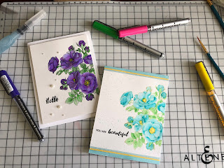
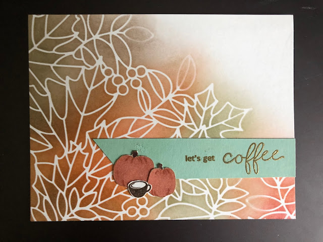
That right, it says Apricot Appeal. And then I realized I not only had ONE sheet of card stock left, but I had an AA Stampin' Spot AND marker. REALLY! I was surprised too. So, I had to use them. Now, I'm not lovin the paper color (Yikes it is bright!), but blended with the Calypso Coral the ink looks spectacular! The color combo reminds me of Hawaiian flowers and I tried to make them look like coral hibiscus, but a bit more old-time. I used a long retired aida background stamp, Fabulous Florets, and Happy Watercolor for the sentiment. DSP is Watercolor Wonders and retired Winter Frost specialty DSP. Originally I used antique silver instead of the pearls, but one look here will tell you why I switched. Pearls just make it so elegant.
This is a big card, about 6.5x5.25. I'll have to make an envelope for it before I give it to anyone! Yeah for the envelope maker!!!
My DD walked in while I had my Stampin Spots out (from a pre-demo time years ago when you could get whole collections of them together - I had 3 sets before I finally broke down to the Classic pads). Anyway, I don't have them anymore, they were 'lost' in DD's craft area, never to be heard from again. So glad I saved them for her! Oh, and does anyone else miss Sage Shadow??


Comments