Posts

ColourQ #156

Image
I am so glad to be back!  PTA has run me ragged for the last few weeks, so much so that I look at the end of the weekend and have touched no paper, no glue, no scissors.  Oh have I missed it!  So, to ring in a new start here is my contribution to this week's ColourQ challenge I'm always looking for a more masculine color combo and this one did the trick!  Tho I would never have picked these colors myself they really came together, and not in the fall-style that I was tempted to turn to.  Plus, I just love Love LOVE Dusty Durango and was glad to get to pull out my marker again.  This was very quick to put together and would have been even faster if I had left the embossed paper with straight lines instead of zig-zagging them.  Anyway, thanks for looking.  Gotta get back to the game.  Go Rangers!!!! Jean

ColourQ Challenge #152

Image
I've been away for awhile.  No excuse except summer!  But now that it is over I hope to post at least once a week.  Promise I will try harder!!! This week's ColourQ combo really spoke to me.  I have loved Bermuda Bay since I first saw it in its in-color days many years ago.  So I enjoyed this challenge! I started out with a Crumb Cake base and layered a thin line of white then Bermuda Bay embossed with the Sizzix script folder with Versamark added to one side for more definition.  I tied it with ribbon and added the Gumball Green stitched ribbon as an accent. I stamped an image from Serene Silhouettes, one of my new favorites, in Bermuda Bay and Gumball Green and cut it with the labels die cut.  I mounted it on DSP from Parisian Breeze pack, another from my 'collection' :),  Added an antique brad and a sentiment from Made for You stamp set in Basic Grey and another little bit of Gumball Green ribbon. Thanks for lo...

ColourQ #144... just in time!

Image
This weeks  ColourQ  challenge was a patriotic combo:  Poppy Parade, Calypso Coral, Night of Navy, Brocade Blue, and White.  I thought flags and kids and fireworks!  But then I was sitting at the baseball fields waiting for fireworks to start and listening to a band play a little Springsteen when the idea came for this card: Nothing says Independence more than the free spirit of ROCK!  And yes, my grunge factor kicked in again this week.  I used Grunge Rock to liven this up.  Oh, and I didn't have any Brocade Blue paper, ran out at least a year ago, BUT I did have the very classic Buckaroo Blue paper and ink to use instead.  I hope you like this throwback as much as I loved creating it!

Vacation and ColourQ

Image
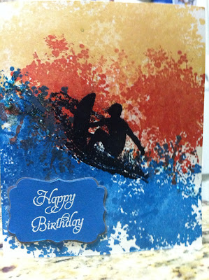
Happy July!   We are back from our vacation to Colorado Springs.  It is so cool to look out the back and see the mountains!  I highly recommend the Cheyenne Mountain zoo and the train up to Pikes Peak.  We brought the heat with us, record temps in Denver while we were there, and then brought them back home too!  Thankfully we just missed the fires and pray for all those in Colorado that are affected by the blaze.  We would have been evacuated if we had still been in town.   So, on the note of water and vacation, here is my take for the ColourQ challenge #143: This weeks colors are Pacific Point, Poppy Parade, So Saffron, Basic Grey and white.  I started out making layered flowers and then, all of a sudden, I saw this in my mind's eye.  Wow!  I used recently retired Extreme Elements, which I still love, and embossed the surfer in black.  Blacks not on the list!  I know, but I tried to mix the black and white powde...

ColourQ #141 for Father's Day

Image
This week's ColourQ colors have a very masculine feel, so I decided to use them for a couple of Father's Day cards for the dads in my life. So, I played with some old texture folders I had stuffed in my craft bin (literally!) and finally decided to go with this: What do you think?  I'm liking the swirlies and waves going on!  Hopefully my dad and hubby will enjoy them too.  Well, that and a new coffee maker, but shhhhh!  don't tell! Have a marvelous weekend!

Colourq... late!!

Image
OK, sorry.  I was running very late getting this into the ColourQ competition on time.  Final embellishments had to be made, phone retrieved from ds, pic and post.  Whew! This weeks  ColourQ  combo was Pool Party, More Mustard, Poppy Parade, Crumb Cake, and White.  Now, I have to admit that Mustard is my least favorite of all the SU colors, i.e. I reallly! don't like it.  But. This combo isn't too bad.  I really like the PP and PP together (too bad Poppy Parade is retiring in 3 days!!!) and they look fab with Crumb Cake so.... here is what I came up with.  This set is another retiring hostess set, Love and Care.  The frames are continuing in the new catalog, tho, so look for more fun ideas on using them. Thanks for looking, and happy Memorial Day!

ColourQ Entry of the week 5/20/2012

Image
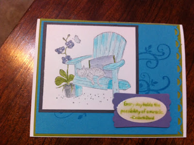
This is the card I am submitting for this week's ColourQ Challenge.  The colors we used this week are Tempting Turquoise, Wisteria Wonder, Lucky Limeade, Basic Grey and White.  I used a well-loved, and nearly retired, stamp set Peace Within and "water colored" the image with the colors.  The message is from the same set; I filled it in with Crystal Effects to make it stand out, but it made the ink smear a little.  I'll have to play around with that and see if I can get a better result if I dry it more quickly with a heat gun or use a craft ink instead of classic.  Thanks for looking!