Posts

ColourQ #141 for Father's Day

Image
This week's ColourQ colors have a very masculine feel, so I decided to use them for a couple of Father's Day cards for the dads in my life. So, I played with some old texture folders I had stuffed in my craft bin (literally!) and finally decided to go with this: What do you think?  I'm liking the swirlies and waves going on!  Hopefully my dad and hubby will enjoy them too.  Well, that and a new coffee maker, but shhhhh!  don't tell! Have a marvelous weekend!

Colourq... late!!

Image
OK, sorry.  I was running very late getting this into the ColourQ competition on time.  Final embellishments had to be made, phone retrieved from ds, pic and post.  Whew! This weeks  ColourQ  combo was Pool Party, More Mustard, Poppy Parade, Crumb Cake, and White.  Now, I have to admit that Mustard is my least favorite of all the SU colors, i.e. I reallly! don't like it.  But. This combo isn't too bad.  I really like the PP and PP together (too bad Poppy Parade is retiring in 3 days!!!) and they look fab with Crumb Cake so.... here is what I came up with.  This set is another retiring hostess set, Love and Care.  The frames are continuing in the new catalog, tho, so look for more fun ideas on using them. Thanks for looking, and happy Memorial Day!

ColourQ Entry of the week 5/20/2012

Image
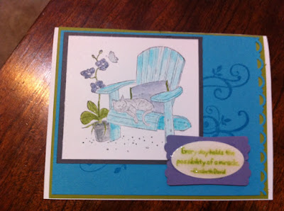
This is the card I am submitting for this week's ColourQ Challenge.  The colors we used this week are Tempting Turquoise, Wisteria Wonder, Lucky Limeade, Basic Grey and White.  I used a well-loved, and nearly retired, stamp set Peace Within and "water colored" the image with the colors.  The message is from the same set; I filled it in with Crystal Effects to make it stand out, but it made the ink smear a little.  I'll have to play around with that and see if I can get a better result if I dry it more quickly with a heat gun or use a craft ink instead of classic.  Thanks for looking!
Image
Ohhh!  I am so excited!!!  One of my cards was selected as a ColourQ Courtier!  What does that mean, you ask??  Well, just that someone else liked my card and gave it props.  So yippee! and thanks for supporting me in my little addiction/business! This is the one that was selected: Did I mention that I am excited???  Ok, enough self-congratulations.  I need to get on making some extra-special cards for my ds going off to 1st grade learn-a-lot camp at school next week.  I'm not sure I have enough cool boy-themed stamps, but I'll scrounge around and see what I can come up with :)  I am also making 2 sets of cards for both kids' teachers' retirement/end of year gift.  Lots to do, lots to do!  And I have 5 new SU in-color inks to play with!  So much makes me tired just thinking about it.

ColourQ and a few more

Image
This is my  ColourQ  submission for this week. Colors are Always Artichoke, Pear Pizazz, Daffodil Delight, Tangerine Tango, and Whisper White. I used one of my favorite soon-to-be-retired stamp sets, Inspired by Nature and the hostess set Perfect Words. I just love the bold look that these sets give! A card I made for a friend/s birthday.  Another retiring set, The Nicest Things, and Flirtatious Specialty designer paper.   A Mother's Day card for my MIL.  Kind of a nice Victorian feel without feeling TOO vintage, don't you think?  I used retiring sets  Baroque Motifs and Vintage Vogue with Beau Chateau designer paper and an Antique brad. I'm getting my 1st order from the NEW catalog on Monday, so look here for some fun new product postings!

ColourQ challenge - 5/5/12

Image
This week's  ColourQ  challenge were the colors Ruby Red (I used Riding Hood Red cause I am fresh out of retired Ruby Red), So Saffron, Pool Party, Early Espresso, and Whisper White.  The combo was fun to play with.  I found some DS paper with butterflies that gave me a start and then, voila! Here is the card, Enjoy!

New ColourQ entry + Stampin' Up Retiring Products

Image
This week's  ColourQ  challenge colors are Pool Party, Calypso Coral, Pumpkin Pie, Bravo Burgundy, and Very Vanilla.  At first glance this combo DID NOT appeal to me, but the more I thought on it the clearer my design became!  I love it when a card just snaps together!   Now, in honor of the newly-released retirement list from Stampin' Up, I am using as many of those consumable products as possible. This page uses Pocket full of Posies Designer Series paper, Poppy Parade, Pear  Pizzazz , Rich Razzleberry, Baha Breeze, and So Saffron card stock, labels framelit and Early Espresso bakers twine.  Poppy and Pear papers are retiring as well as Pocket DS paper and the stamp set I used for the journaling, Notes and Details, which is probably the best scrapbooking set I have seen in the catty in the past few years! A little card I made for Pierce's birthday last month.  The retiring DS paper Well Worn is the background paper, Cajun Cra...